
Corporate identities and international style
Because everything in the nature is searching for balance after the years of war and depression
the world came again to it is normal (as far as it can be) life.
Fast economy development, revolutions in science, technology and production - as Faithless sing "we want more" (and eventually we got it at 2008).
Still keeping the rationalism and utilitarian attitude the graphic design turned to one more functional direction.
Switzerland, image and identity systems
As an inheritor of the Constructivism came the new International Typographic Style. It was build neutral and universal for the rising corporate needs. As business organizations the corporations are struggling to be attractive and understandable for their customers.
Clean, usable, understandable, universal (and boring) this style was meant to unify visually the big multicultural organizations. Тази корпоративна идентичност заедно с Заедно с логото. представляват новия имидж на компаниите.


За нуждите на бизнеса биват създавани и множество нови фотнове, отличаващи се с четливост и изчистеност. Използването на един фонт з различни параметри създава усещането за concistensy.
Ето за това едно то изискванията за новите фонтовете е дамогат да изразяват йерархията в информацията. Един нов фонт трябва да изглежда максимално добре при различна големина, дебелина и наклоненост.
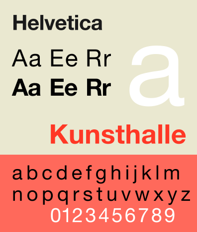
One of the most popular was Helvetica.
The graphic designers had an easy job - to shape the whole image of the company. This already includes new media. The first TV commercial appears at 1941.
Here is an commercial of Tide from 1950
It is a classic: clean, white, housewife that that enjoy to wash with Tide.
Корпоративната идентичност обаче е тясно свързана с основните таргет групи и започва да се променя заедно с потребителите. Започвайки от благоприличната сдържаност на 50, дивотията на 60те, социалната ангажираност на 70те и ...останалото в другата тема.
Една от компаниите която вече 50 години успява да запази своята популярност движеки се на гребена на новото е CocaCola.
Ето една реклама на Coca - Cola от 1950.
Изглежда забавно близо 50 години след. Явно телевизионните реклами са се променили доста. :)
This is a video from 60s
Освен цветн рекламата вече е много по динамична. Дори музиката е различна.
А ето как изглежда рекламата 10 години по късно във време на насрастналата социална активност.
Липсва предишната динамика. Младите хора са много по мирни и се създава усещането за група.
Вероятно унификацията в такива мащаби е била първия знак за предстоящата глобализация.
The corporation - this new animal in the economic scene begin to play considerable role in many aspects of people's life. Агресивността с която компаниите се борят за вниманието на консуматора ги прави все по креативни (и все по манипулативни)
Разглеждайки някои от рекламите можем да видим и как се променя посланието в тях.
50s
Ok. the war is over! Have fun. Hedonism. Materialism. Conservatism. Enjoy but be decent. Make it Quick. This is Good for you. Take it. It is delicious. You will be pretty with this lipstick.
( now it looks a bit annoying somebody to tell you what taste has the product or what is beautiful) And very often there is a whole story explaining the image


Want something good? Of course you do! You have to! You must like Coca Cola!
No doubt, she would love to have spoons for Christmas!
And no wonder why at the end of the decade poped up Barbie! And it is still here- think about that! :)

No comments:
Post a Comment