The styles after 80s are very eclectic. They mix elements of punk, disco and grunge and transform them into new styles.
One of the things that really makes an impression those days is the mix between candy sweet colors and elements of disco and elements of Gothic. It looks like many of the contemporary commercial patterns and (t-shirt) designs are playing with the idea of romantic dramatism of death.
Even in baby clothes. I really believe that it is a sigh for an end. Probably the end of this mixing eclectic time. Chaos, fragmentation (somehow similar to dada), horror, schizophrenia (remember the bluetooths- people really look mentally ill)- this is only one side of the currents. The other side is smart (not so sweet but still polished) advertisement (and actually attitude)
What is postmodernism? Confusion, overused ideas, mixture, buzzing mind, technology, moral changes, disco. It is debatable why 80s was time for big changes. Probably as a result of the social awareness or because of the economic crisis the late 70s. The 80s are much more sober. The Pop kitsch of 70 gradually is developed into rebellious punk.
Pop era is passing Rubick's cube style is gone. (for a while)
After punk came the "dirty" Grunge that express the feelings of youth - rage, social isolation, aggression, sadness, depression. It express the freedom of being looser. It is characterized with negligee, baggy clothes, torn jeans, rough ends. Ironically exactly the fashion of the losers became successful next decades. This of course lead to its commercialization, the loss of charge and finally to its exhausting.
Grunge font
Grunge style penetrate also in printing materials and advertisements.
Deconstructivism This style embodies the idea of fragmentation. Distorted, twisted, wired buildings express the despair caused by the lack of new ideas.
60s We could say one word - pop culture. If you have a conservative society for some time you will have and decent, "reasonable", teasing, mind washing products and also designs. The messages are not so direct and imperative but still eye-candy. People are having fun, getting new cars, girlfriends (boyfriends), dishwashers, TVs -what about you?
More manipulative, more colored, also playing with types. Font types diversity, flat colors that begun to appear. Some of the creative ideas of 60s were so good so they was reused 50 years later. Well there were some exceptions. Do not forget - emancipation, Beside the mainstream madness there were people who decided to be even more crazy refusing the common "sense". Make love not war!
70s People become more socially aware. They become concern about the war, human rights, environment. The feminism movement. Also there is economic slump. Two polar world. Soft rock and disco music. Flat colors. Plastic. Lines.
The 70s look less euphoric.
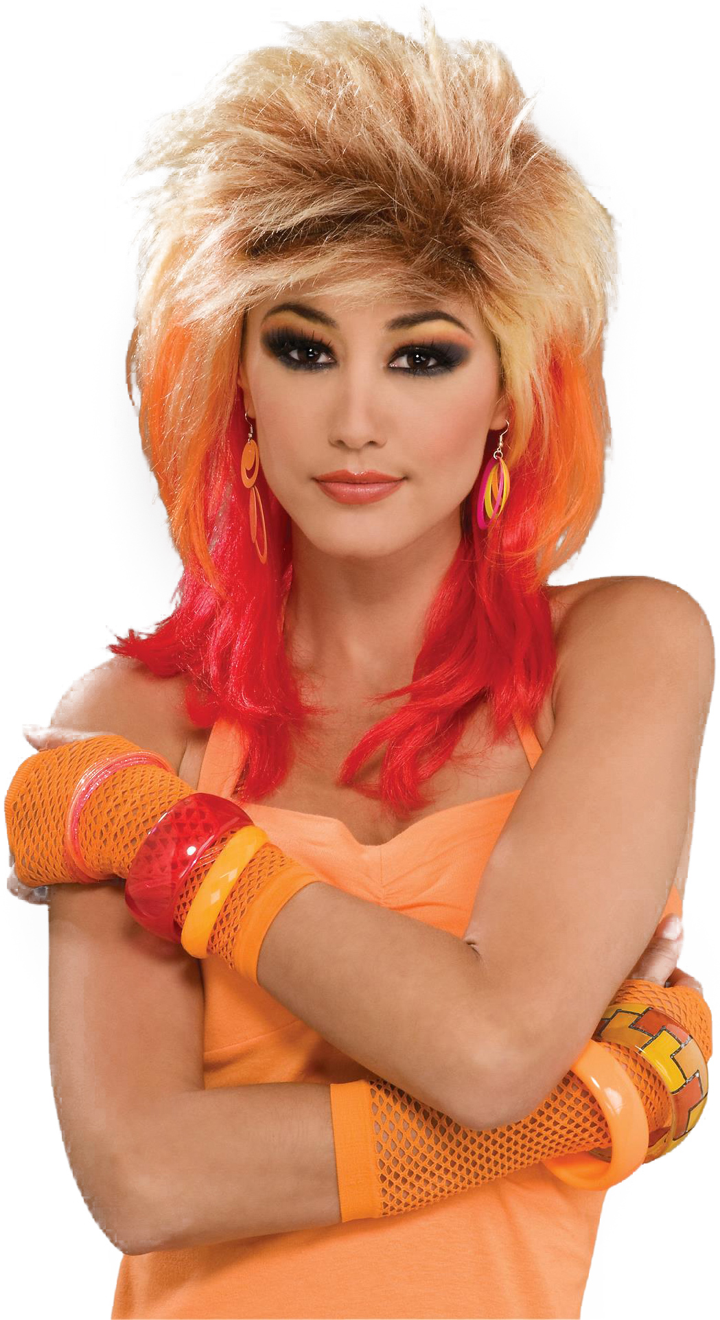
This tendency is visible not only in printing material but also in the patterns, colors and shapes of the interior. Orange, red and yellow are very popular colors, also we can see a lot of lines and geometric shapes.
The ball chair with its futuristic and clear shape become one of the most recognizable features of 60s- 70s style. The same spirit have the jewelery. Plastic, flat colors, geometric design, bright colors - so typical for the disco style.
Many fonts in the 70s follows the same guides - geometric shapes, lines, flat and thick impression. The second main group are again thick but more curly, decorative, female and playful.
Photocomposition of lettering gives much more freedom for designers. The letters could overlapped, fitted, outlined in the photo composition. But this freedom brings and new responsibility in designer's decisions. The geometric forms are visible also in architecture. As Technology became fashion the urban space was converted to cold grey-concrete, glassy, geometric place.
The cities speed up their life's making human mind more buzzing. But about that in next theme.
Because everything in the nature is searching for balance after the years of war and depression the world came again to it is normal (as far as it can be) life. Fast economy development, revolutions in science, technology and production - as Faithless sing "we want more" (and eventually we got it at 2008). Still keeping the rationalism and utilitarian attitude the graphic design turned to one more functional direction.
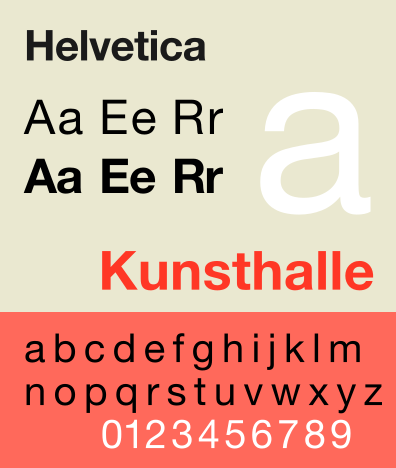
Switzerland, image and identity systems As an inheritor of the Constructivism came the new International Typographic Style. It was build neutral and universal for the rising corporate needs. As business organizations the corporations are struggling to be attractive and understandable for their customers. Clean, usable, understandable, universal (and boring) this style was meant to unify visually the big multicultural organizations. Тази корпоративна идентичност заедно с Заедно с логото. представляват новия имидж на компаниите.
За нуждите на бизнеса биват създавани и множество нови фотнове, отличаващи се с четливост и изчистеност. Използването на един фонт з различни параметри създава усещането за concistensy. Ето за това едно то изискванията за новите фонтовете е дамогат да изразяват йерархията в информацията. Един нов фонт трябва да изглежда максимално добре при различна големина, дебелина и наклоненост.
One of the most popular was Helvetica.
The graphic designers had an easy job - to shape the whole image of the company. This already includes new media. The first TV commercial appears at 1941.
Here is an commercial of Tide from 1950
It is a classic: clean, white, housewife that that enjoy to wash with Tide.
Корпоративната идентичност обаче е тясно свързана с основните таргет групи и започва да се променя заедно с потребителите. Започвайки от благоприличната сдържаност на 50, дивотията на 60те, социалната ангажираност на 70те и ...останалото в другата тема. Една от компаниите която вече 50 години успява да запази своята популярност движеки се на гребена на новото е CocaCola. Ето една реклама на Coca - Cola от 1950.
Изглежда забавно близо 50 години след. Явно телевизионните реклами са се променили доста. :)
This is a video from 60s
Освен цветн рекламата вече е много по динамична. Дори музиката е различна. А ето как изглежда рекламата 10 години по късно във време на насрастналата социална активност.
Липсва предишната динамика. Младите хора са много по мирни и се създава усещането за група.
Вероятно унификацията в такива мащаби е била първия знак за предстоящата глобализация.
The corporation - this new animal in the economic scene begin to play considerable role in many aspects of people's life. Агресивността с която компаниите се борят за вниманието на консуматора ги прави все по креативни (и все по манипулативни) Разглеждайки някои от рекламите можем да видим и как се променя посланието в тях.
50s Ok. the war is over! Have fun. Hedonism. Materialism. Conservatism. Enjoy but be decent. Make it Quick. This is Good for you. Take it. It is delicious. You will be pretty with this lipstick. ( now it looks a bit annoying somebody to tell you what taste has the product or what is beautiful) And very often there is a whole story explaining the image
Want something good? Of course you do! You have to! You must like Coca Cola! No doubt, she would love to have spoons for Christmas!
And no wonder why at the end of the decade poped up Barbie! And it is still here- think about that! :)